Andrea Simons
Designer
Seattle Area
andr3asimons@gmail.com
I enjoy creating highly crafted experiences that people love. I look for ways to simplify systems, bringing meaning and clarity to the user. Content can be beautiful.
Select Projects
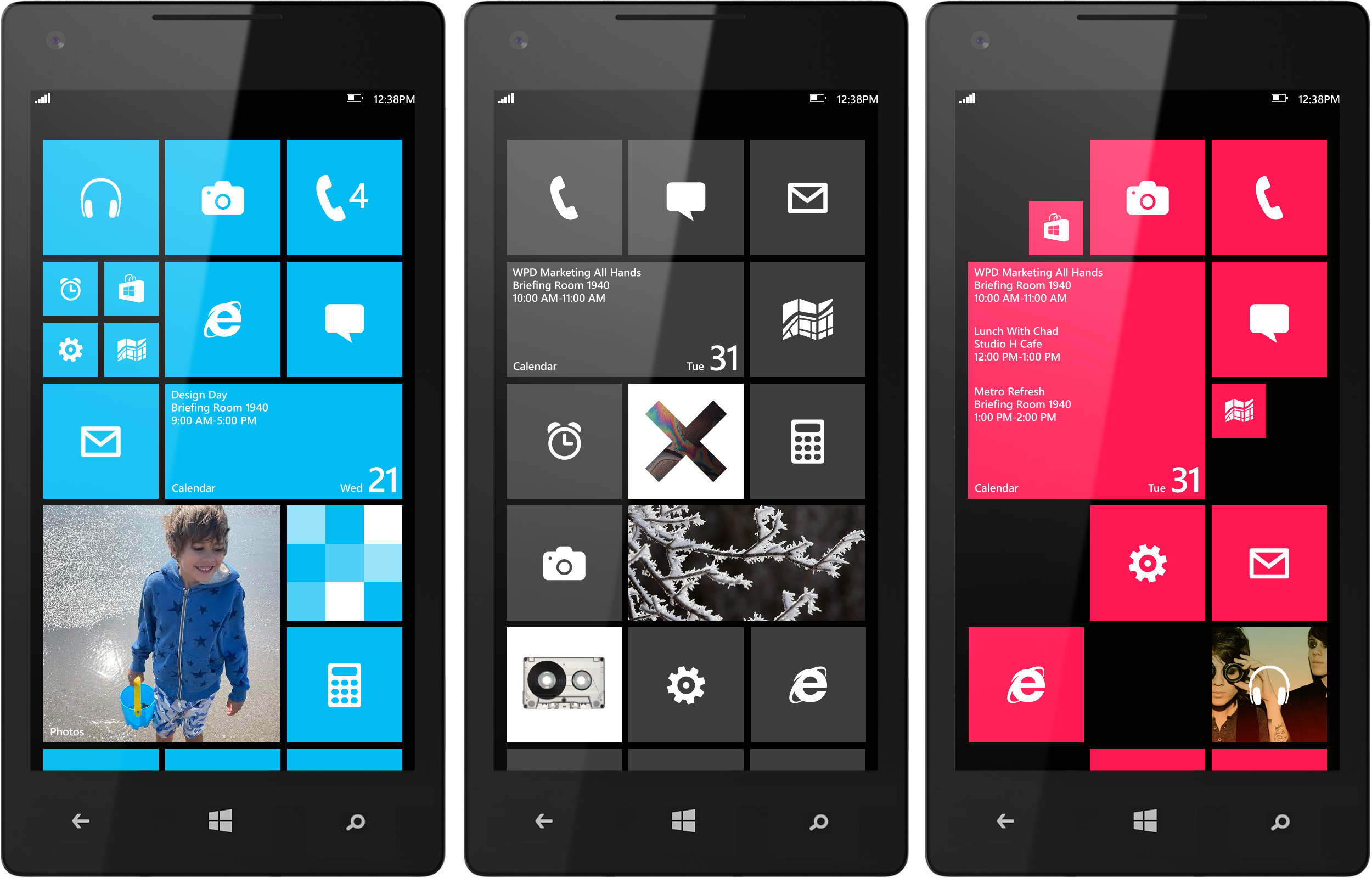
Windows Phone
Start Experience
For Windows 8 I was asked to evolve the start experience. Start is Windows Phone’s home screen. It is a personalized space designed to reflect the user. I explored how start could offer more flexibility and customization. I designed various grids with corresponding tile sizes. Tiles representing the application it would launch but never replacing it. Start expanded from a 2 column grid with a fixed tile system to a 3 column grid with a resizable tile system. The user could resize the tiles to a small, medium or large size revealing more or less content. This allowed the user to prioritize what mattered to them the most.

Windows Phone Style Guide
In the process of evolving the Windows Phone style guide, I explored various grids and tile sizes across multiple resolutions and display sizes, evaluating the strengths and limitations while preserving the iconic brand. I redefined tile sizes, dimensions, type, and interaction for content across multiple devices. Provided design specs for production and engineering teams. I also redesigned the proportions of the app-icon story to present a cohesive system that supports the Windows Phone brand.
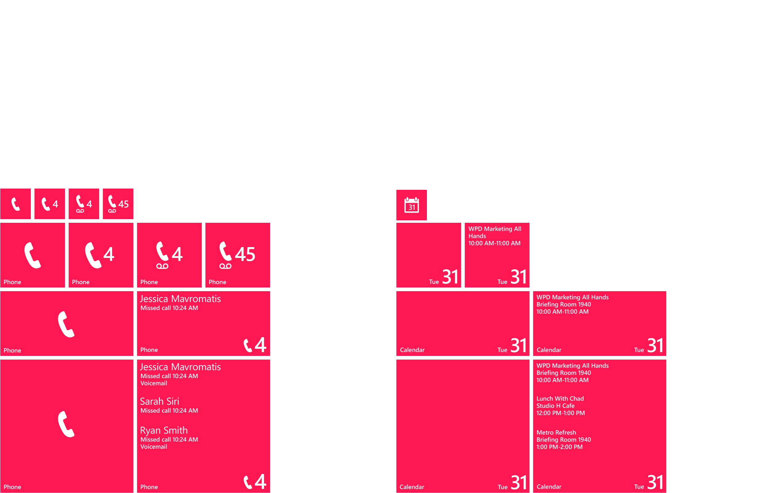
Windows Phone Tile Templates
I created numerous tile template designs for both first and third party apps. The adaptive resizable tile system gave the user flexibility to reveal more or less content allowing the user to prioritize what mattered most.
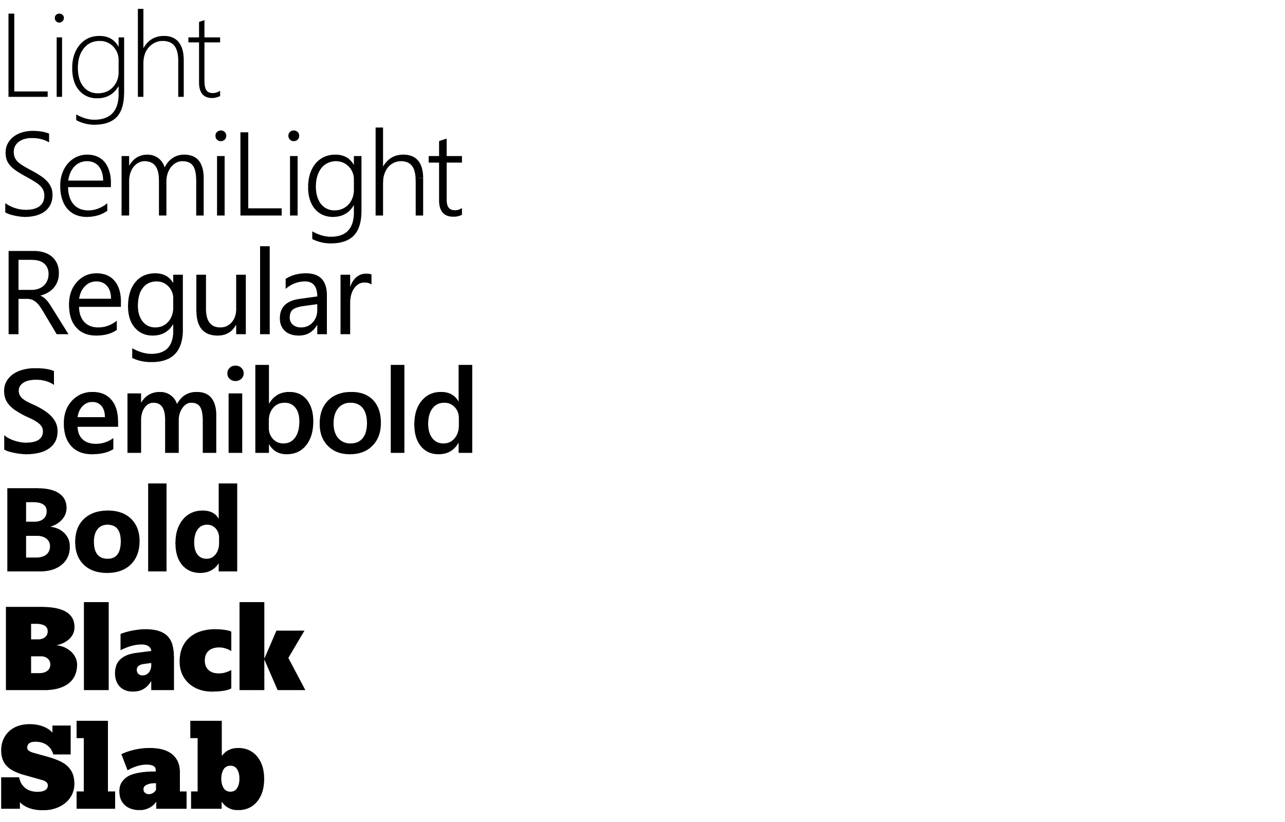
Typography
The Segoe typeface was created specifically for Windows Phone. With the help of my art direction, we expanded the type family and created Segoe Slab, used to bring an editorial aesthetic to the Windows Phone design language. I also created type ramps and guidelines to include specifications for various type weights, sizes, spacing, alignment, character count. This not only applied to start tiles but throughout Windows Phone to support a cohesive system throughout the experience. I would explore various combinations of type, color and imagery to achieve optimal solutions across multiple sizes and resolutions as well as using clear information hierarchy to meet users needs.

Windows Phone Magazine View
Magazine view was a concept created for Windows Phone as a new pattern to showcase content with an editorial aesthetic. When the user interacts with the type it comes to life through motion bringing a new dimension to information hierarchy.

Windows Phone Explore
Explore was a concept created for the user to explore the content of their search in an editorial browse like experience. Imagining the user had picked up a magazine to browse content but had done so seamlessly on a WP device until a specific content type drew their attention deeper.

Windows Phone Panorama Pattern
Windows Phone panorama is a horizontal side scrolling pattern used for a browse like experience for Windows Phone hubs. Hubs being a group of a specific content type. I was asked how Windows Phone panorama pattern could evolve. The application title took 1/3 of the screen on the previous pattern. After numerous type configurations the pattern could now display more content per screen while still preserving the look and feel and also allowing for information hierarchy to guide the user to what to look at first.

Windows Phone Panorama Pattern
Windows Phone’s panorama pattern took our user through many screens to get to the content at the end of the pattern. How could we give our user a way to jump screens within the pattern? The orange menu pictured above allowed our user to interact with the category located at the top of the screen that would jump them seamlessly to the content that mattered most.

Iconography
I art directed teams of people for Windows 700+ icon system. I created examples to follow, reviewed and approved every icon.

Children’s Illustration
I created this art for my son’s room when he was a toddler. I divided the art in 3 equal pieces, framed each and hung them above his bed. I tell him I love him to the moon every night.

Poster Art
I created this poster for fun.